

The Glassmorphism Dilemma: Beautiful Trend or UX Nightmare?
A Designer's Double-Edged Sword: The Allure and Agony of Fluid Glass Design
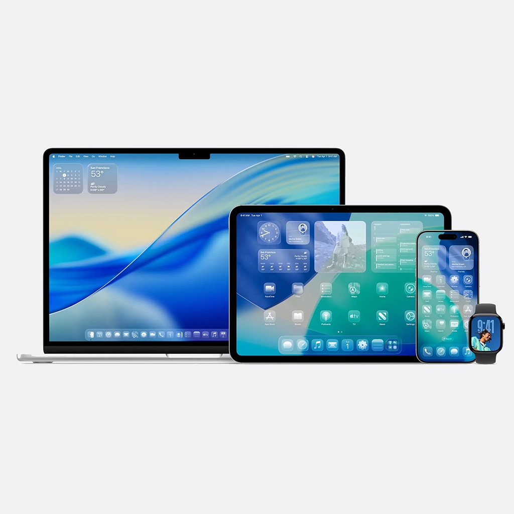
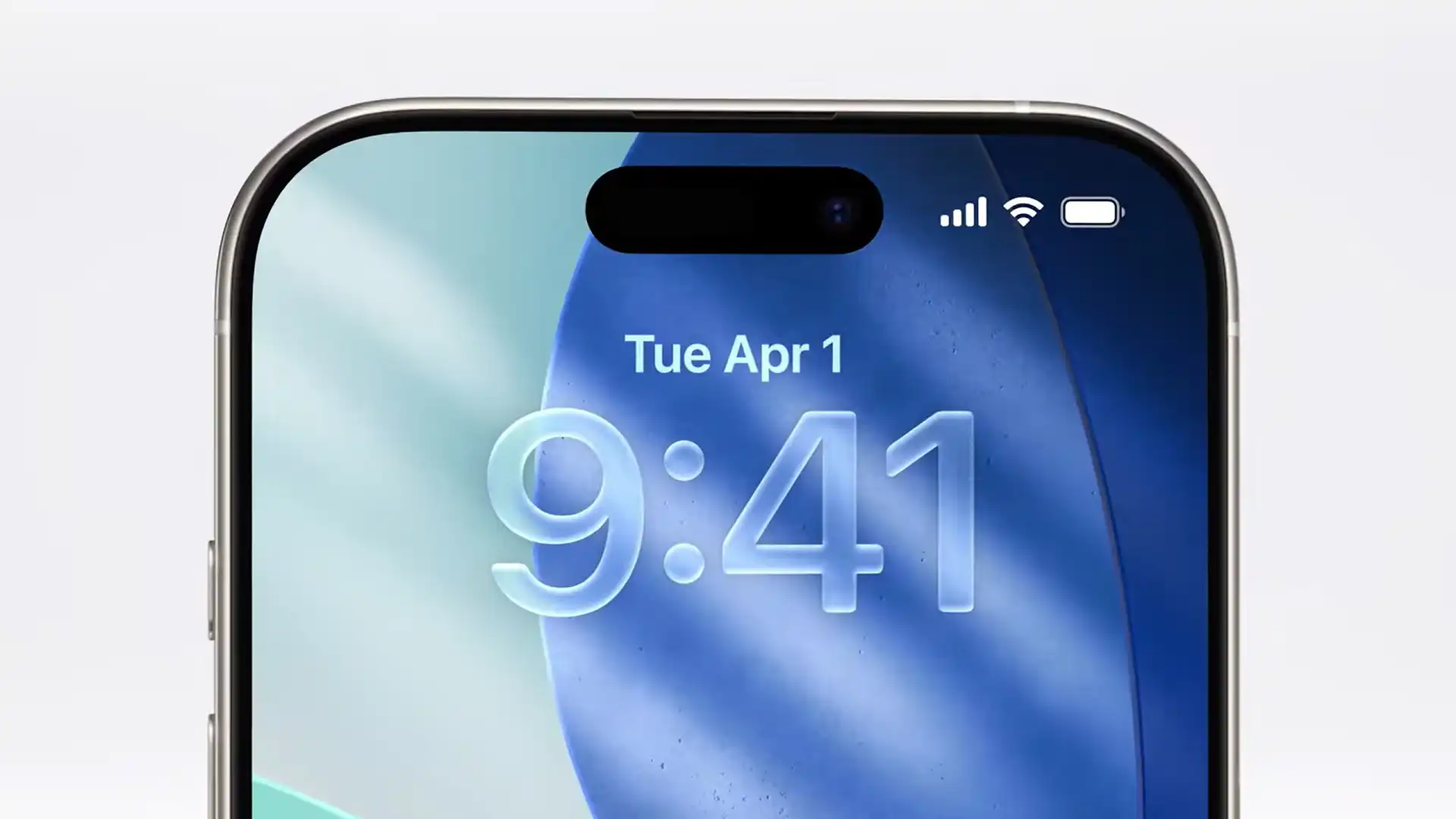
You’ve seen it everywhere: on macOS, Windows 11, and across countless concept designs on Dribbble. That translucent, blurred, and ethereal effect known as Fluid Liquid Glass, or Glassmorphism, has firmly cemented itself in the modern design lexicon. It creates a sense of depth by layering a frosted pane of glass over a colourful background. From a purely aesthetic standpoint, it’s undeniably beautiful. It feels modern, light, and sophisticated.
But as designers, our perspective forces us to look past the surface beauty. Our job is to balance the desirable with the usable and the accessible. We must ask the harder questions: Does this aesthetic choice serve the user’s goal? Who are we excluding with this design? What are the hidden costs of this stunning visual trend? While its appeal is obvious, the Fluid Glass effect is a classic designer’s dilemma—a double-edged sword that presents as many pain points as it does strengths.
1. The Strengths: The Designer's Rationale for Using It
There’s a reason this trend became so popular. When used thoughtfully, Glassmorphism leverages visual principles to enhance the user experience.
- A Clear Sense of Hierarchy and Depth: The primary strength of this style is its ability to create a tangible sense of space and a clear z-axis. The frosted glass panel sits “on top” of the content behind it, immediately establishing a visual hierarchy. Users intuitively understand that the blurred background is contextual but not currently interactive, while the crisp content on the glass panel is their primary focus. This creates a tactile, layered interface that feels organised.
- Enhanced Focus Through Contextual Blurring: By blurring the background, the design cleverly draws the user’s eye to the foreground elements. Unlike an opaque card which completely severs the connection to the underlying content, the glass effect maintains a contextual link. The color and texture from behind provide visual interest without creating distraction, guiding the user’s attention to the buttons, text, and interactive elements on the glass pane.
- Modern and Airy Aesthetics: Let’s be honest: a key part of our job is to create visually pleasing products. This effect feels futuristic and clean. It allows vibrant colours and imagery to peek through, giving interfaces a dynamic and personalised feel without overwhelming the user. In a world saturated with flat design, Glassmorphism brings back a sense of texture and materialism that is visually engaging

"Design is not just what it looks and feels like. Design is how it works."
Steve Jobs, Co-founder of Apple Inc.
2. The Pain Points: Where the Design Fails Its Users
This is where a designer’s professional responsibility kicks in, forcing us to critique our own beautiful creations. For every point of praise, there is a significant, and often critical, counterpoint.
- The Accessibility Nightmare: This is, by far, the biggest failure from a design perspective. Achieving sufficient color contrast for text and icons on a semi-transparent, variably-colored background is incredibly difficult. A button that is perfectly legible over a dark part of the background might become completely unreadable when the window moves over a lighter section. This makes the design inherently hostile to users with visual impairments, such as low vision or color blindness, and will almost certainly fail to meet Web Content Accessibility Guidelines (WCAG). A design that is not inclusive is a failed design, period.
- The Unpredictable Background Problem: As designers, we strive for control over the user experience to ensure consistency. Glassmorphism forces us to give up that control. The final look of our UI depends heavily on the user’s chosen wallpaper or the content behind the window. A busy, high-contrast background can turn our clean interface into a chaotic mess, completely undermining the goal of creating focus and leading to a poor, inconsistent brand experience.
- Performance and Implementation Headaches: A good designer must also consider the technical constraints. That beautiful real-time blur isn’t free. It’s computationally expensive, requiring significant CPU and GPU resources to render smoothly. On older devices or complex applications, this can lead to lag, stuttering, and increased battery drain all of which are major usability issues. For our developer colleagues, implementing the blur, transparency, and borders consistently across platforms is a delicate, time-consuming task.
3. A Designer's Verdict: Use with Extreme Caution
So, is Fluid Liquid Glass a good or bad design trend? From a designer’s perspective, the answer is neither. It’s a powerful aesthetic tool that is only suitable for very specific situations.
It’s a fantastic choice for non-critical UI elements within a controlled environment, such as a desktop operating system’s decorative sidebars or transient notification centres. However, it is a perilous and irresponsible choice for mission-critical applications and web content where legibility, accessibility, and performance are non-negotiable.
As designers, we must treat it as a spice, not the main ingredient. Use it sparingly to add a touch of elegance and hierarchy, but always have a plan B—an opaque fallback to ensure that your interface remains functional and accessible for every single user. The allure of the glass is strong, but our professional duty to create inclusive and usable experiences must always be stronger.
Join the Conversation: What's Your Take?
Share your thoughts and experiences in the comments below. If you found this article insightful, please pass it along to your colleagues and network to bring more voices into this important conversation.
This is such a critical breakdown. As a designer, I’ve been battling this exact issue. That ‘unpredictable background problem’ is so real. We had a design that looked stunning on our developer’s dark-mode setup but was completely unreadable on a user’s light, busy wallpaper. We had to add a strong opaque fallback. Your point about WCAG is spot on—accessibility has to win over aesthetics. Thanks for writing this!
Great article! I love the look of Glassmorphism, and I think it really pushes the ‘layered’ feel of modern UI. But you’re right about the performance. We implemented a blur effect on a sidebar, and the performance hit on older laptops was immediately noticeable